home
about the artist
gallery
blog
links
contact

Archive for January, 2011

Eggplant Color Play

Wednesday, January 5th, 2011

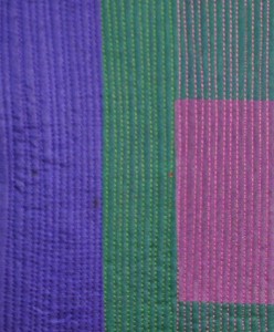
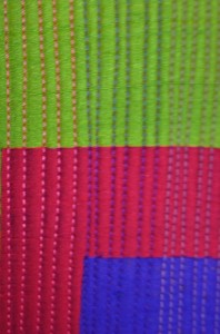
I am having so much fun playing with the colors for our Twelve X Twelve color play theme. I am using the same layout, but different color ways and fabrics. I went to Mill Ends this morning on a quest to find silk in colors that really nailed the theme. This photo is not a good replication of the colors at all. The red is winier and the eggplant is a really deep aubergine. So far it is my favorite of the three I have done. I am going to do one more tomorrow, switching the wine and green.

As you can see, I am trying to do some perfectly spaced stitching on these. Not an easy feat for me. I did buy some Guttermann silk thread that matches the fabrics perfectly, and it sews beautifully.

I had this really ugly fabric in my stash of fabric for backs.

I have to wait a week before I can share all of these with you. I plan to do one more and then move on to other pending deadlines.

Something you won’t see on my blog are sketches. This will be a sketch free zone. LOL! It seems every one is doing it in some form for the new year. I am not against sketching, but I don’t feel that concentrating on it will help me achieve my goals. If you want to see some excellent sketching, I recommend the Urban Sketchers blog. Much of the work there is just fantastic.

I am really interested in experimenting with innovative surface design techniques and surveying the art world for contemporary abstract artists whose work might inspire me. So that is what I will be posting this year in addition to my own creations.

Back in the Studio & New Artist Crush

Tuesday, January 4th, 2011

I finally broke through the morass that was holding me back from getting any work done. It is not earth shaking or very imaginative, but I cut, fused, sandwiched and stitched up two possible pieces for the next Twelve x Twelve eggplant  color play theme. The three colors are eggplant, wine and emerald green. I have posted a couple of sneak peeks. The top piece is silk organza and the other is silk dupioni. None of the colorways is perfect, but I am trying to have fun and get as close as I can. I may do a couple more pieces until I feel that I have the right combination of colors.

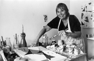
Another plan that I have this year is to find artists whose work speaks to me and to find out a bit about them. I recently came across the work of Beatrice Mandelman (1912-1998). She started her career in New York, but eventually settled with her husband in Taos in  19944 where they were part of the art scene. Here is photo of her at work. I was intrigued that all of the photos of her working show the work on a table rather than an easel.
Much of her work is in large, bold, colorful amorphous  and wonky shapes.
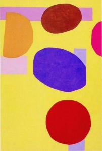
Untitled from the Space series: 1972
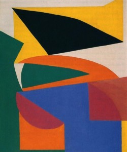
Blue Moon; undated, 1960s
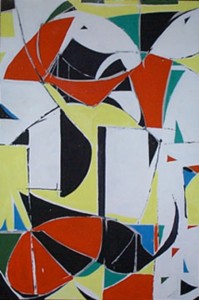
Jazz II, 1986

I love her fearless use of color and the shapes that are repeated.

The following is from and article in Art & Antiques Magazine, Dec/Jan 2011

Despite Mandelman’s considerable distance from modern art’s most active centers, her work is noteworthy for its strong affinities with certain artistic developments of its time. Much of it is a fusion of post-Cubist, gestural-abstractionist techniques; much of it is also a record of her experiments with bold, often primary, colors and ambiguously emotive forms. Mandelman’s art could be quiet and meditative in light-toned compositions featuring gentle washes of layered-on color or boisterous and rollicking in paintings like those of her late-career Brazil or Jazz series, with their patches of black and bold, solid hues.

In the 1980s, Mandelman said, “I’m an original. I broke all the rules. I’m using a very primitive language—squares, circles, triangles, primitive colors. And I made a very sophisticated art out of it.” Years later, she added, “I don’t have an external story in my paintings, and that’s difficult for people to accept.”

Mandelman had a strong sense of herself and her achievements, even if big-name success eluded her during her lifetime. In 1971, after a Taos gallery presented an exhibition of work by women artists that was emphatically ignored by the media, she quipped, “If we’d thrown our bras into the Río Grande, we could have gotten all the attention we wanted.” Later on, she told an interviewer, “My own painting turns me on. I feel it in my heart, the same feeling I get when I hear good music….I’m trying to work from chaos into order, stripping away, using the basics; that part is intellectual. We’re all different, but I think all real artists are working toward the same thing.”

“What’s that?” her questioner asked.

Mandelman replied, decisively, “Freedom.”

That last paragraph tickled me. She was definitely a woman who knew herself and with a wicked sense of humor. You can read the whole article here.

Zimbabwe Textile Art

Sunday, January 2nd, 2011

The art Exhibit for Trinity Cathedral Arts in December is always  work represented by an outreach program. We have done Haitian arts, local out reach programs such as p:ear, a resource center for homeless youth and this year we invited the Zimbabwe Artist’s Project back for a second time. The parish hall was brimming with textile wall hangings telling delightful stories as well as a variety of painted pieces. 100% of the funds collected goes back to the organization. In this case it will go back to Zimbabwe where it is much needed for food and clean water.

I selected the piece above which is about 36″ by 12″. The artist Orpah Mungure. (Did you know that Oprah’s name is a misspelling of Orpah, a Biblical name?) If you click on her photo, you can read about her.

Here is the story of her piece. Mbuya (granny) Shonge is on the way to the shops to grind some mealies (corn) She meets her brother Tigere. She is greeting him.

Mbuya is holding some firewood so that she can put some fire in her kitchen to cook her food for lunch.

Tima is giving Mbuya Shonge a basket so that Mbuya can give her some mealie meal (cornmeal) to cook sadza (thick porridge) because of hunger in Zimbabwe.

This was hand written by the artist. The original is tucked into a pocket hidden in the applique. Isn’t that cool? I love the applique in the wonderful African textiles. This is a real treasure.

Here is my sketchbook with the tie. I made a video of the sketchbook with my new Flip camcorder, but it is not that great so I am going to do it again. I have a short video of the cover, but I can not figure out how to get it in the blog. I will figure it out someday.

I spent some time getting my self portrait mounted on stretcher bars. It needs to go to Trinity on Tuesday. Thursday night, we have an opening reception from 6 – 8 pm. If you are in the area come by.

My artist’s statement: The black and white image is based on a photo of me when I was twenty. Fifty years later, I am not the beauty I was then, but I am a much more colorful and interesting person.