


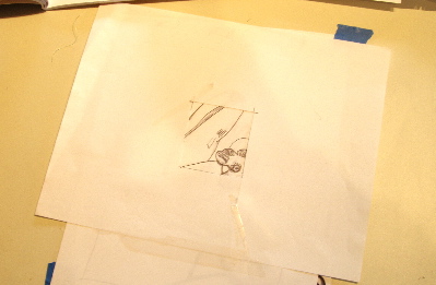
For this assignment, I had to go back to the contour drawing that I did in the first exercise:
Then, I had to cut a rectangle in a sheet of paper, 2 1/8 by 2 3/4 inches. Using the box, I had to find the focal point and find an arrangement that pleased me. I came up with this diagonal composition:
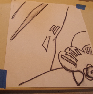
Next, I had to enlarge this 400 times to 8.5 X 11 inches:
Then, I needed to do a value run of one color, using the gray value run that I created yesterday:
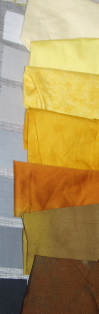
This was a very useful exercise. I think I did a good job of getting the 7 different values.
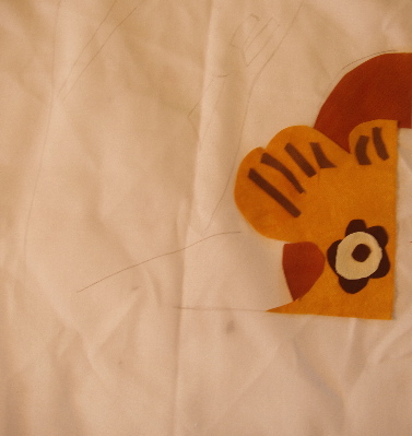
Then, I had to trace the design components onto fusing and transfer to fabric and cut them out. The instructions were to use the lightest and darkest values in the focal point and not use them any place else in the design. Here, I am beginning to lay out the design on white fabric that has the design drawn on it:
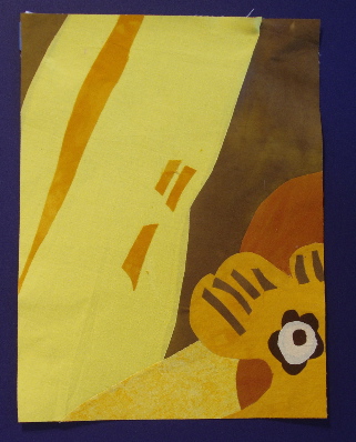
And here is the final monochromatic composition:
The next exercise is an achromatic composition so I will be using my stash of black and white graphic fabrics.
Hi super creative Pointless Sister. I have been plodding along on the same exercises – not as far along as you are. I like both colors and design you did.
Cathy
Very cool – almost Warhol-ish, I can’t wait to see what you do with the B&W’s – I have a huge stack of them myself….
Yep, I found the matching the values with the gray scale very very helpful too. The focal point was well achieved in this piece. I’m not sure if I have good choices for the achromatic composition. I’ll aim to post it this coming weekend.
Great job, Gerrie! Wonderful colors…
Wow, I really really like this, Gerrie. What a great way to push past the obvious. It has an Asian feel, perhaps, like a woodcut.
Nice! I think your focal point is much more sucessful than mine was. I need learn to simplify more, like you and Karoda.
Wonderful color choices!
When are you having time to do these while packing? Impressive. And congrats on the house sale!
This is fabulous! Great choice of focal point and wonderful execution!